[Updated 2009-04-20 TidyRead, Readable, Readability]
Bulk of Internet is text. Sometimes design skills (or lack of any) make that text unreadable or unfitting specific monitor/resolution.
There are quite a few online tools to transform web pages in form better suited for reading so I decided to compare those.
What was I looking for
- good for widescreen layout (I use 19” 1440x900 monitor);
- easy and fast to use (via bookmarklet or otherwise);
- saving traffic for use on notebook with mobile Internet;
- possibly flexible enough to be used on N810 tablet (its browser could really use some help).
Original page
To not point fingers I am taking my own recent review of Dell Vostro 1310 as example page. Here is how it looks like for those RSS subscribers who should visit site once in a while. :)
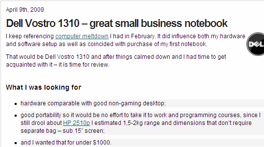
read_original
TidyRead
Service works by filling form with URL or using bookmarklet (superior and faster according to instructions).
read_tidyread
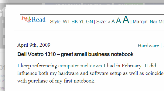
Result is presented in overlay over original page. And improvement is quite poor:
- not much change except font;
- unnecessary eye candy;
- bookmarklet didn’t work, saying my post is not a detectable article.
[Updated 2009-04-20]
- interface got more dynamic, allowing to choose style and print page.
Link http://tidyread.com/
Readability
Only available as bookmarklet that must be first customized by selecting combination of text style, size and side-margins (effectively column width).
read_readability
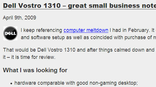
Clean and customizable looks.
- correctly determines and shows core content;
- strips styling from images, which may break layout;
[Updated 2009-04-20]
- additional buttons for fast reload original page, print and share by email;
Link http://lab.arc90.com/experiments/readability/
Finch
Available as form and bookmarklet.
read_finch
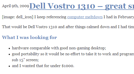
Choice of liquid layout is questionable but filtering is great:
- URL format is easily scriptable;
- strips page of everything (including images) except text;
- encrypted version available.
Readable
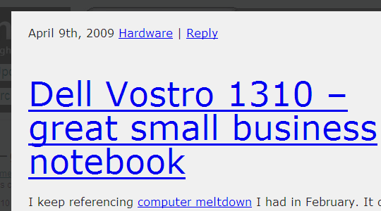
Similar to Readability - bookmarklet that requires initial customization. Displays text in overlay column.
read_readable
- good customization;
- didn’t work for me at all across different sites and browsers. Fail.
[Updated 2009-04-20]
- even more customization options;
- bug fixes to improve compatibility;
Link http://readable-app.appspot.com/
PrintWhatYouLike
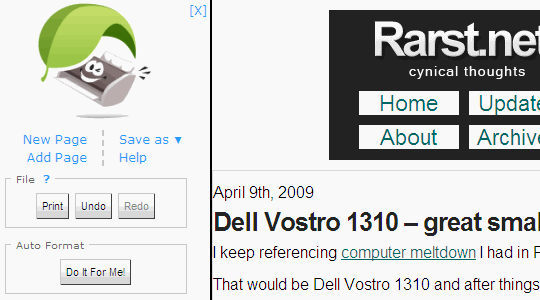
Closer to online application. Its goal is to prepare page for printing. Can easily break layout and hardly single-click.
read_printwhatyoulike
- good bookmarklet if you often print pages;
- bad and messy for reading.
Link http://www.printwhatyoulike.com/
IYHY
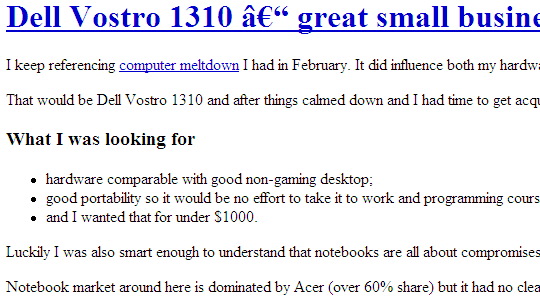
Optimized for mobile. Strips everything (up to styling) except text.
read_iyhy
- easy URL format but no native bookmarklet;
- character encoding issues;
Link http://www.iyhy.com/
BareSite
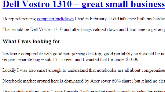
More of a service, displays page framed by own links.
read_baresite
- strips most of styling and scripts but leaves images;
- easily scripted;
- additional services.
Not even sure how service is properly called. :) Very mobile-centric.
read_google
- easy URL format;
- gives a choice of loading or skipping images;
- downsizes large images;
- auto-discovers RSS links;
- splits long pages into few.
Link http://www.google.com/gwt/n
Overall
There is no ultimate choice with clear distinction between services either aimed at desktop or mobile usage. Most suffer from complete lack of options, developers make decision for user which is rarely good approach when text is involved.
My personal choice for now would be:
- Readability for reading at desktop (customizable, works and looks good);
- Finch for mobile connection (flexible, good filtering).
I no longer browse from my Nokia E60 smartphone but Google is clear winner for mobile browsing (if not taking in account excellent Opera Mini browser).
[Updated 2009-04-20]
Bugfixes and rapid increase of functionality on some of services. So far Readability is still my main choice and works very smooth.
Do you use any kind of text formatting to read online? What is your way of making reading in browser most comfortable?
Sources
Numerous articles from Lifehacker, Digital Inspiration, Download Squad and MakeUseOf.
TidyRead #
Gabriel Coarna #
Rarst #
Use Colour Contrast Analyzer to ensure text is readable | Rarst.net #
Edit Opera context menu for cool tricks with links | Rarst.net #
The DataRat #
Rarst #
Quix – multi-functional and customizable bookmarklet | Rarst.net #