For me choosing color scheme for anything is always a challenge. I can recognize good one, but making one form scratch is pain. There are many tools that boil task down to color wheel and some basic theory – I find approach lacking.
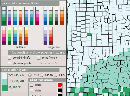
Colorbrewer is a specialized web app on color schemes for maps. With many advanced features that really give it edge as general-purpose schemes source as well.
What it offers
Site is done completely in Flash, together with all relevant textual information. Result is snappy and works good with extensive preview map.

Instead of color theory site emphasizes nature of data represented and that colors remain distinguishable in any proportion.
Strong features
Aside from data-driven approach there are also good accessibility options. Schemes can be limited to those that will look fine:
- to colorblind people;
- printed in color;
- printed or photocopied in black and white;
- any combination of the above.
Results can be easily exported for use with Adobe products or simply as text set in RGB, CMYK or HEX.
Overall
I don’t know just how happy this site makes people who actually use it for maps. But it worked excellent for me when I needed to built set of extensive diagrams and pie-charts in same color scheme.
Color schemes site offers may not be very flexible but it guarantees excellent looks and usability.
The DataRat #
Rarst #
Geek Squeaks’ of the Week (#36) « What's On My PC #