Almost year ago I had posted how to optimize Opera for large amount of tabs and one of the tweaks that came up in comments was about vertical (sidebar-like) tab bar. I discarded that as non-mainstream tweak at the time.
Year later I won’t have my tabs any other way than on my right. So, what is merit in such tweak and what ways of using browser (not necessarily Opera) it fits?
Tab anatomy
Every tab carries number of elements:
- site favicon;
- page title;
- unread indicator;
- close button.
Amount of open tabs affects how effective some of these are:
- favicon – always;
- title – with low amount of open tabs;
- unread indicator – always;
- close button – never (it’s plain evil, just disable and close with middle click).
As for screen space that all of tab bar occupies – all modern monitors have widescreen format. That means when display gets larger it gains more in width then it height.
So vertical space is precious, horizontal space is expendable.
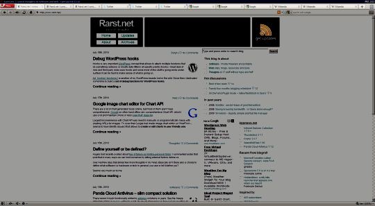
Horizontal bar
Classic one. Tabs are displayed in horizontal line (or multi-line) and their size is dynamic – they get smaller when there are more of them.

opera_tabs_horizontal
Disadvantage is clear – with large amount of tabs it is hard to distinguish between pages. At least favicons make it easy to distinguish between sites.
Advantage is that you open a lot of tabs and it will be cramped, but always remains absolutely usable.
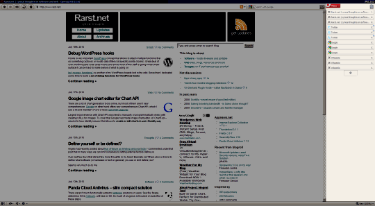
Vertical bar
To try it in Opera Right-click tab bar > Tab Bar Placement.
This one is geeky. Tabs are displayed in vertical stack as sidebar. Their size is static – width and height remain constant.

opera_tabs_vertical
Disadvantage is that this view has limit of hitting screen bottom. Since tabs can’t get smaller from there they can either go off-screen, or force bar to multi-column (eating unreasonable amount of space on all but giant resolutions).
Advantage is that page titles are clearly visible at all times and favicons are close, instead of being spread. This organization makes much easier to keep open group of pages from same site and still see their individual names.
Overall
Horizontal tab placement favors browsing large amount of pages from assorted sites. Good fit for random browsing or just for following habit.
Vertical tab placement favors moderate amount of pages from few sites. Good fit for research and reference browsing.
Had you ever tried vertical tab placement? What were/are your impressions?
Angelo R. #
David Rader #
Rarst #
Rarst #
Moving Browser Tabs To The Sidebar #
Bob #
Angelo R. #
Rarst #
Riparazioni Torino #
Rarst #
Riparazioni Torino #
Rarst #
Geek Squeaks’ of the Week (#70) « What's On My PC #
Richard #
Rarst #