When I start to go back and forth between something it is a sign that I am alternating two wrong approaches. I’ve been having such issue with several sites that are interesting enough to check often, but not valuable enough to check too often. Yes, Twitter is one of them, but there are couple others.
Keeping them open wastes time. Opening when needed also wastes time. Solution is to minimize time it takes to open. So I poked Opera interface several times and tinkered something fitting out of main bar (one of toolbars).
What is main bar
Main bar is one of those Opera toolbars that ended up on the sideway. It is remnant of times when browsers had a lot of buttons.
Main bar hosts such “important” buttons as save page or tile windows. Yawn. So we will be scraping those and repurposing main bar into killer lightning fast bookmarks bar.
Customization
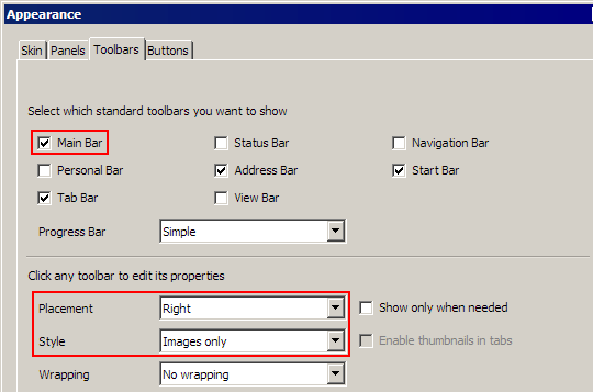
- Menu > Settings > Toolbars > Customize
- Check Main Bar
- Set Placement > Right (or whatever, but right fits nicely with sidebar-style tabs)
- Set Style > Images only

opera_main_bar_customize
- nuke default buttons by Right click > Customize > Remove From Toolbar
- fill with bookmarks by Shift + Drag from bookmarks panel (or tabs when customization mode is active);
- add spacers from Buttons (next tab to Toolbars) > Spacers (fixed work best)
Result

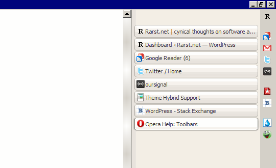
What we got is very compact, structured bar of bookmarks, that is:
- faster than Speed Dial (no need to open tab);
- supports Shift+Click (in new tab) and Ctrl+Shift+Click (in new background tab);
- better than bulk folder open (easier to access, easier to open selectively).
Downsides
- main bar is not synced with Opera Link;
- curiously it doesn’t react to middle click (which I use as faster Ctrl+Shift+Click).
Why not personal bar?
By description personal bar is even better for this:
- it can host bookmark folders;
- it can host searches;
- it is synced by Opera Link.
For me deal breaker was that for some weird reason it doesn’t support spacers. Searches and folders don’t work well in vertical bar anyway so I went with main bar.
Otherwise personal bar is very valid alternative for almost identical result.
Overall
For a small slice of screen you get very fast way to open sites. I use Opera for years and it still amazes me how flexible interface is and how far you can push it to save your time.
Geek Squeaks’ of the Week (#78) « What's On My PC #
Saurabh #
Rarst #
Saurabh #
Rarst #