#StandWithUkraine

Solarized - comfortable color scheme for code

I am strongly visual person, yet choice of colors is something I am no good at. While I can appreciate it, the process of going from nothing to working ensemble of colors falls on overly artistic side for me. That is why I am always charmed even more by color combinations, that are not only pleasant, but functional in design and mathematical in nature.

Colorbrewer is my constant reference for graphs and now I have discovered Solarized - color scheme aimed at presentation of code and rich text.

Basic principles

Solarized includes sixteen colors, split into content (main text), background and accents. The most impressive trick as that it includes both light and dark backgrounds which work with same text colors. Accent colors can be used to put together common schemes (analogous, complementary and so on), but amazingly they don’t fall apart even in more wild combinations.
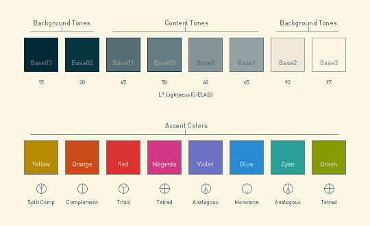
Solarized color scheme

Resources

While Solarized as scheme is essentially set of colors (and provided as such in more color systems that I know) it was engineered to work well with code highlight.

It is provided as ready-made color schemes for number of code editors, terminal apps, color palettes for graphical editors and build instructions for custom implementations.

Practical experience

Since it caught my attention in context of PhpStorm it was no-brainer to try it with. Color schemes for PhpStorm are available, only bit hidden under umbrella platform name IntelliJ IDEA.

While native color scheme in PhpStorm is perfectly functional, I found Solarized considerably better experience. It is more pleasant to look at and it handles multiple colors better - noting jumps out at you, while legibility and contrast are perfectly noticeable.

Overall

Solarized might look a little washed out and not overly flashy, but it has a lot of amazing aspects and great color scheme for code. Also I am already itching to bend and apply it for other purposes. :)

Link http://ethanschoonover.com/solarized

Related Posts

8 Comments

  • dan l #

    That's a pretty slick palette. I think I will actually try to use it for some charts. 2 other color tools that I really like: http://www.colorhunter.com/ - give it a picture and it will extract 6 colors from it. That's pretty cool and all, but it also stores what everybody else finds and makes it searchable. http://www.colorjack.com/ - several tools for playing with colors. The sphere in particular is really cool and you don't really need to be a rocket scientist to use it.
  • Rarst #

    @dan l In colorbrewer terms Solarized will probably only work as qualitative color scheme, won't make a good sequential gradient. Hadn't used it in charts myself yet. Thanks for links, will play with those! But as per post what I can come up with myself rarely makes good set. :) I doubt simply averaging picture to some colors does that often as well.
  • dan l #

    For good charts I need 2 or 3 dominant colors, 2 intensities each + a whole lotta gray. But, I know some people need the gradients pretty hard core. It's easy to get carried away and throw a ton of colors at people, but the reality is - it's more important that you make effective use of a few than it is to have dozens of them. That's just me, your mileage may vary. Here's another link that I use which kind of does it by giving you a dull set and a vibrant set from the same picture: http://www.degraeve.com/color-palette/index.php And for your gradiant needs: http://herethere.net/~samson/php/color_gradient/ And just another tool: http://colorschemedesigner.com I'm pretty fortunate that I work for a mega corporation that has a whole department somewhere dedicated to brand standards and the like. They publish a 20 color palette which I can just hack into Excel, so I've saved a little bit of time by not having to mess with this stuff. That said, there's lots of tools online that make creating your own palette relatively easy without having to be a graphic designer. I'm basically color stupid, and I can pretty much fumble my way through to something pretty decent.
  • dan l #

    By the way, I keep having to adjust out my links because your filter catches me. Just so you know: i'm not a bot:)
  • Rarst #

    @dan l When dealing with maps especially often you can't get away with few colors, too many data points that need to be displayed at appropriate intensity. Recently I've actually had to code in PHP how to get color at specific point between two other colors. And then it was very complicated to pick appropriate datapoints for min/max and intermediary labels. Sorry about links, it is one of the low hanging fruits of dealing with spam. :) And one of the very few cases when I find more appropriate to ask visitor to follow guideline... Alternative being me dealing manually with extra spam messages because I am very committed to keeping false positives close to zero.
  • dan l #

    Your map sounds like a challenge! Truthfully, I tend to avoid maps a bit. I spent a lot of time learning to do them in Excel thinking that eventually I would whip out my awesome choropleths or just dots on a map, and people would say "OH WOW THAT'S AWESOME DAN L", but I've really struggled to come up with an appropriate and effective execution in my world. I think more or less it's because I'm a bit of a minimalist and maps typically overlay fairly complex data over fairly complex data (it is, after all, a map). Or maybe I just don't have the skill level to make it work. And it's not like I'm overly dogmatic about it either. I'll try working one into a project now and again, but if I lay out a dozen dashboard elements, I'll almost always be able to pick out 11 that I think are better than the map based chart. But interesting. Ya know, I would definitely read a post with some cool data visualisation technique..... :)
  • Geek Squeaks’ (#58) – Using a Voice Recorder, Advanced System Info Tool, Windows 7 Defrag, Super Image Editor, and Color Schemes for Coders « What's On My PC #

    [...] Rarst.net Solarized – comfortable color scheme for code [...]